
Colorbyte Blogs
Unveiling the Power of Color Communication
Color. It’s everywhere we look, from the vibrant hues of a sunrise to the calming blues of a tranquil ocean.But beyond their aesthetic appeal, colors hold a deeper power – the ability to communicate on a subconscious level. Understanding how colors influence our emotions and behavior is key to unlocking the potential of color communication in various aspects of our lives.
The Language of Colors: Psychology and Perception
Our perception of color is a fascinating interplay between science and psychology. Light waves of different wavelengths activate specific photoreceptor cells in our eyes, triggering the sensation of color. However,our brains also play a crucial role in interpreting these signals and associating them with emotions,memories, and cultural meanings.
For instance, red is often linked with passion, excitement, and even danger. This association might stem from its connection to fire, blood, and ripe fruits. Blue, on the other hand, evokes feelings of serenity, trust,and reliability, perhaps due to its connection to the vast sky and calming waters.
The Color Palette of Emotions: Choosing the Right Colors
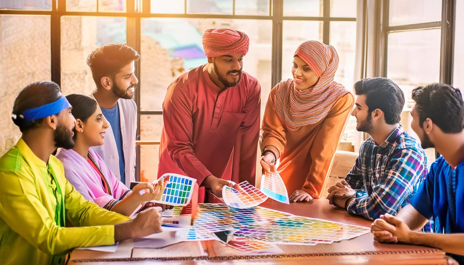
Understanding these color associations is crucial for various fields, from marketing and design to healthcare and education. Here’s a glimpse into how specific colors can be leveraged for communication:
-
- Red: Grabs attention, stimulates action, ideal for calls to action, warnings, or high-energy branding.
-
- Orange: Represents enthusiasm, creativity, and warmth. Can be used for promoting social interaction or energizing a space.
-
- Yellow: Evokes happiness, optimism, and intellectual stimulation. Well-suited for educational materials or promoting new ideas.
-
- Green: Symbolizes growth, nature, and balance. Perfect for promoting eco-friendly products or creating a calming atmosphere.
-
- Blue: Creates a sense of trust, security, and professionalism. Widely used in finance, technology, and healthcare branding.
-
- Purple: Associated with luxury, royalty, and creativity. Can be used for high-end products or fostering creative thinking.
Beyond the Basics: Cultural Considerations and Context
It’s important to remember that color meanings can vary across cultures. For example, white might symbolize purity in Western cultures but represent mourning in some Eastern cultures.
Understanding these nuances is critical when communicating with a global audience. Researching cultural color associations is crucial to avoid unintentional misinterpretations.
Color Communication in Action: From Websites to Products
The power of color communication extends to various aspects of our lives:
-
- Websites and Marketing: Strategic use of color can enhance brand recognition, influence user behavior,and guide them towards desired actions.
-
- Product Design: Color choices can impact how a product is perceived. Consider the calming blues and greens often used in medical equipment or the playful colors employed in children’s toys.
-
- Interior Design: Colors can set the mood and functionality of a space. Warm colors like orange can create a cozy atmosphere, while cool tones like blue might promote productivity.
The Art of Color Communication: A Journey of Experimentation
Understanding color psychology is a valuable tool, but it shouldn’t be a rigid formula. Experimentation and testing are essential. Consider your target audience, the message you want to convey, and the overall context when making color choices. A/B testing different color combinations on your website or using color mockups for product design can help you determine the most effective options.
Colorbyte is an awesome tool to experiment with color
Conclusion: Unveiling the Potential
Color communication is a powerful tool that can significantly impact how we perceive and interact with the world around us. By understanding the psychology of colors and their cultural connotations, we can leverage their power to create more engaging and impactful experiences. So, the next time you choose a color for your website, design project, or even your outfit, remember the story it tells and the emotions it evokes. After all, in the world of color communication, every shade speaks volumes.
Get In Touch
call us
+91 9899690320
Email Us
sukhvinder@profounddesigns.in
colorbytetools@gmail.com
Opening Hours
10:00 AM - 18:00 PM
Monday to Friday
Saturday & Sunday Closed
Visit Us
Profound Designs
1F, 2nd Floor, Above Shree Govindam Sweets, Shahpurjat, New Delhi-110049, INDIA
One Response
The above information is helpful and it is important to understand color psychology while creating any design related to any business.
Social Media Marketing plays a important role in brand building to know more visit this link https://vaibhav.live/ .